Logo and branding essentials for a captivating website
How to look your best online
Before we start, let’s be clear that your brand- just as your business evolves and changes over time.
Whether you’re already established or just starting out, you want to take your business to the next level with a new website. Branding is part of that.
It's more important than ever to have a clear understanding of how your clients are feeling and what will resonate with them.
What are the essentials for branding?
There is a lot of confusion about branding and logos (is a logo a brand?) and I want to break it down for you.
This is what I’ll cover in this post
Logo types (primary, secondary, and submark)
Custom Patterns and/or Elements
Colour Palette Selection
Typography (font) Selection
How important is accessibility in branding?
What is a full branding suite?
How does photography fit in?
1. Logo types
Let me reassure you that a logo is not essential for your business success. Nobody will work with you because they love your logo.
It’s perfectly fine to use a text-based logo or just the font from your website. If you create a logo yourself e.g. using Canva keep it simple. It can easily look “homemade” and may weaken your brand's look. .
Talking about Canva: Canva offers ready-made logos that might seem like a good idea. Just be aware that they are:
Generic and your competition could use the same
Copyright protected “Your rights to the logo are non-exclusive and you can’t register it as a trademark.”
You can read more information on the Canva website
The best option is to work with a graphic designer to make up a new business logo.
Many people have a great aesthetic eye but not the technical skill to make a good logo or brand assets. Think of it like a mum making their child’s birthday cake, the diy one takes a lot of work and is full of the right sentiment but might turn out a little wonky…
I can recommend some wonderful designers for different budgets and styles.
For those "just wanting a logo" (not a full brand design), you should at least be provided with the logo in various configurations.
Primary Logo Design
This is the main logo that you use on your website and on business cards e.g
Here is an example from my client Donna.
I highly recommend using a rectangle logo for your website header. It will take up the least amount of horizontal space leaving more room for your messaging. You can also use it for your email signature.
Graphic designers usually include an all-white logo for use on dark backgrounds and a dark one for light backgrounds.
It’s important to get both print and digital colour and file format (jpg, .png, .svg, eps, etc). For a Squarespace website, we use the png and jpg files.
If you engage a designer you receive a logo in a scaleable vector format and have the peace of mind that you’ll have the correct formats for all applications moving forward.
Secondary Logo(s) Design
This is not a must-have but e.g. a stacked design version of your logo to use in the footer can be a nice option or you use it in a space where the primary logo format doesn’t work as well.

Logo Submark (or brand mark)
Your logo submark is a less detailed version of your logo similar to a watermark. And can be used as a Favicon (also called Google or a browser icon) or as a brand icon.
2. Custom Patterns and/or Elements
This adds personality and style to your website
I also love to use patterns for custom backgrounds.


*Credit: Logos/elements examples designed by Monique Egan and Stevie Winter
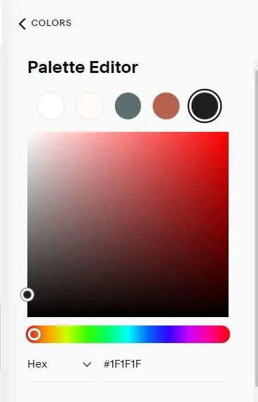
3. Colour Palette Selection
For Squarespace, you’ll need to add a minimum of five colours to the colour palette.
You can manually add as many different colours as you like via the custom option but this is the “foundation” and is also reflected in the colour themes for each section. You can read more on that in this Squarespace help article
Think about it this way you’ll need
White (important for readable text on a dark background)
Light colour e.g. for backgrounds
Dark colour e.g for backgrounds
Accent Colour e.g. for buttons
Black for text. I don’t recommend “all back” because it’s too harsh and reflective on a white background
The easiest way to add colours to Squarespace is by adding the hex code (the # symbol plus 6 characters e.g. #1F1F1F is the off-black I use on this website).
4. Typography (font) Selection
Most websites have a minimum of two different fonts. One type is for headings and the other one is for paragraph text.
It’s always a good idea to combine two fonts that harmonize but still offer enough contrast. The best way to do this is by using a combination of, serif and sans-serif fonts. Serif fonts have little strokes at the end (you can see it in my headings) and sans serif fonts have no flourishes, and are plainer (and therefore more readable- and that’s what you need for paragraph texts).
If you look at your favourite- or well-known brands, you’ll notice how much of the feel and personality of a brand is reflected in their chosen fonts.
Tech brands e.g. Apple often only use sans-serif fonts.
Where do I find the right fonts?
Squarespace has well over 1000 Google and also Adobe fonts available via their site style font selector. We can also add (for free) any Google fonts that are out there. If you are after something specific or more unique, there is also a huge range of fonts that you can purchase. Always make sure you have the right license.
Something else to consider is to pick a font that is also available in Canva so your brand is cohesive from website to social media posts. You can upload custom fonts to Canva Pro (but not on the free version).
Not all fonts are web-safe fonts which means they might not display in all browsers. If we install a custom font, it’s important to set a “fallback” font just in case.
What about script fonts?
Finally, a word of warning when it comes to script fonts. I know they’re popular but they are also hard(er) to read and we want to make our content as easily accessible as possible. If you want to use a script font, only use it sparingly as an accent but not to convey essential information!
Fonts and SEO
Uploading custom fonts can slow down your website and simply put, Google doesn’t like slow websites. Keep that in mind when making your font choices. You might just like one of the pre-loaded fonts that come with Squarespace.
5. How important is accessibility in branding?
You want to ensure that every potential client can read the content on your website. The most important aspects are
Colour contrast: You can check this here
Readability: Is the text readable? Avoid script fonts for larger chunks of text and ensure the font is big enough. As a guide, the font size should be at least 16px (1em).
6. What is a full branding suite?
For a full branding suite, the branding designer digs deeper and the service goes well beyond a logo design.
The goal is to communicate your values, your position, and what you're all about, to the right audience, via the design of all your brand elements.
It’s about the brand strategy and visual identity of your business.
It typically consists of
Deep dive and research to create a really clear picture of your brand, your audience, and how to connect with them on a human level.
Strategy and positioning within your market and how that all comes together to resonate with your customers and best achieve your goals.
Typically you’ll receive Brand Guidelines that you can e.g. share with me, your website designer, or a social media creator. It ensures that no matter who works with you, the visuals of your business will always be consistent.
Deliverables can vary but expect some or all of the following:
Brand Moodboard
Primary Logo Design
Secondary Logo(s) Design
Brand Icon
Colour Palette Selection
Custom Patterns and/or Elements
Brand Imagery
Typography Selection
How does Photography fit in with my branding?
There is a lot to say about branding photography but I just wanted to keep it to a minimum in this article.
Once you’ve created or received your branding colours and the overall direction, it makes sense to use at least some of the colours for your photos. It could be a scarf, mug or earrings that correspond with one of your brand colours. The result will be a very cohesive website where everything fits together.
Don’t worry if you’ve already got your photos done before the branding part. A lot is about the feeling you want to evoke and there are many ways to do this.